

Blades was perfect. No i didn’t need my knockoff mii on the screen and laggy windows 8 ui. It used the full screen to display every bit of information clearly in a way xmb ass could only dream of… Oh what’s that? Did you order some loooooong menu? We all want some loooooong menu to scroll through. FUCK OFF WITH THE NESTING.
UI is reactionary we must return to cli
I HATE WHITE SPACE, I HATE WHITE SPACE

Bring back dense UIs filled with information with as little menu-diving as possible
 space
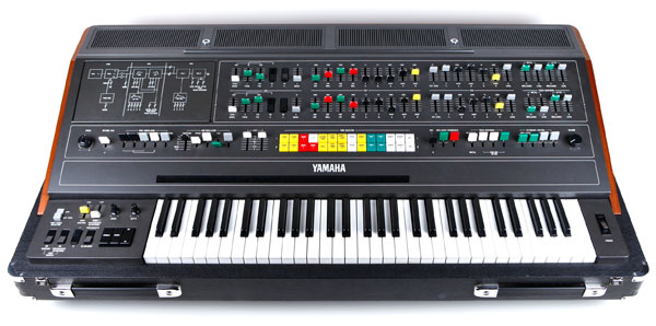
spaceI want UIs that take inspiration from this:
Or this:
https://www.vintagesynth.com/sites/default/files/2017-05/yamaha_cs80.jpg
lol there’s like no modern user interface anywhere that isn’t laggy as hell. It’s crazy that’s considered ok
UI design “peaked” around 2005-9. I think UIs COULD be better but won’t because of trends and $$$. The whole “rounded minimalism” thing works in certain places, but having it everywhere suuuuucks. Its like the push to have everything be a led screen instead of having buttons. Forced upon the masses because its easy and cheap.
I can find something in the pre windows 8/10 menus in a second. Trying to dig through the crap menus of 11 is like trying to interact with the fuckin’ DMV at this point. Insane that I had to go to 2 different places to see what windows update I had installed (neither agreed with each other). Hate that my work laptop was forced to be 11.
I stole the “remaster” of rome total war because I was wanting a kick of slop. Besides a game breaking bug making it where I could either not click or not use 99% of my keyboard (depending on how it felt), holy fuck how do you have a WORSE UI then a game from 2003. The UIs of other modern TW games are ??? at times, but why when I click on the build icon in the bottom middle of the screen, it opens a NEW menu on the middle RIGHT? Why is the building info split into 3 different windows (most info on the middle LEFT, some ABOVE the build icon, and some in a tool tip when hovering over the icon on the RIGHT?) Why is everything so small? Like I SUCK at programming, I’m shocked I’ve kept a job for like 4 years straight, and even I could slap something better together. Give me the codebase to Rome 1 CA, I will “fix” it.
It was so bad I spent like 2 hours fixing rome 1 to run (the most recent patch on steam seems to be completely busted). The UI is bad there, but its old enough to drink at this point.
Didn’t rome 1 get an overpriced remaster that actually works now?
Tbf I think you can still do better than the blades layout. Each window is basically a browser tab but it’s taking up a huge amount of screen real estate on the sides.
If you move all of them to one single bar at the top of the screen with LB/RB to switch pages you regain all of the sides.
Memories of being in college and playing lost planet and dead rising on the 360, this was all before my life went down the shitter.
The demo for Crackdown was great, it was a full section of the game with a 20-30 minute time limit. Perfect for a quick run through.
Same with Just Cause 2, good times.
I played lost planet on loop i love that game.
It’s great! I wish I still had my 360 to play it, not the same on pc for some reason.
Extremely my shit. Hoping Crapcom fixes Lost Planet 2 any day now…
Best way to play is xbox backwards compat on system link I have found. Such a shame the PC version is basically unusable
Sadly no xbox

I got it to run perfectly on PC…once. The single miracle session of LP2 co-op, worked even with the dead GFWL still latched on… Hasn’t functioned since of course.
I see someone never used the last version of the PS3 store.
It was the same as the PS4 store which is already pretty bad, but unbelievably slow.
I didn’t start buying digital on console until the ps5 when the physical copies became glorified digital licenses but I did go on the ps3 store to buy battlefield 1943 and it was probably the worst storefront I’ve ever seen. Clicking a button has a response time of like 3-5 working days
I bought uncharted 3, along with the Last of US DLC and Gran Turismo 5 DLCs, was a huge pain in the ass to get downloaded. Took forever to load the storefront. The actual downloads were pretty fast though. But the game updates, oh god. Gran Turismo 6 had something like 25-50GB of updates in dozens of parts. The PS3 was not designed for that. Took literal days to update without any errors because it bombed out every couple of parts.
Gt5 and 6 was put the disc in and come back the next day kinda game updates. I have a vague memory of it needing user input after every part it downloaded to install it but i can’t remember for certain. I just remember hating it alot.
I have a vague memory of it needing user input after every part it downloaded to install it but i can’t remember for certain.
Yeah this was GT6. If you didn’t manually do every part one by one it would bug out all progress would be gone. GT5 was put the disc in and wait for the next day. Yeah it sucked. The games were cool, but that console generation was not designed for those kind of updates.
PS3 store was an absolute disaster. So slow. Supporting background downloads and installs almost 20 years ago came at a huge cost to speed.
Unbelievably slow doesn’t even begin to describe how slow it is. Easily one of the most frustrating experiences I ever had with an interface.
Good thing pirating PS3 games are extremely easy and RPCS3 is fairly good.
brb, imagining I’m pressing the LB and RB bumpers over and over for the next five minutes
Material design and its consequences
this predates material design by a decade
The edges look like the console itself, what more do you want?
The PS4 UI was terrible and a clear downgrade from the PS3 and PSPs XMB UI. The PS5 thankfully returned to a more XMB like UI.
God I miss this…
It look like a Winamp skin had a tumor.


