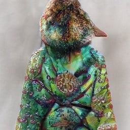
Render unto AI slop what belongs to AI slop.
Where is it from?
Europe is currently redesigning the Euro currency. This is one of the proposed new designs. You can check out the 10 proposed designs that Europeans are voting on here. OP’s image is the back side of design C.
There’s also a survey at that link where you can give your opinion on all the designs. Anyone can fill it out; you don’t need to be a European.
Omg fuck off with all the birds. E is good
I think the reason there are so many bird designs is because the people on the bills don’t represent every country in the EU. Some nations feel left out. But (most) everyone enjoys birds!
They’re not even European birds for some
i filled it out and voted “most ugly” on all the faces and “barely acceptable” on all the bird ones.
it sucks that there’s no free-form response field on the questionnaire. i would have so much to comment about these incredibly bad designs.
that’s the EU’s secret plan sothat we all give up cash voluntarily
Looking Memphis as hell.
I’m guessing you meant Corporate Memphis, not Ettore Sottsass Memphis. Though it could do with wavier arms, for that webinar-promo look.
artstyle
“art style”, right? Did you have to over-rule your spell check like I had to over-rule mine?
It doesn’t bother me much, since the meaning is clear. It reminds me of German. We might have more compound words as English continues evolving and we keep slapping words together.
On a similar note, I am surprised to see “over-rule”. I’m used to seeing “overrule”.
This looks to show community. European community. Money is a community tool for fair corporation. I actually quite like it.
Its not about the things depicted but about the art style. It is primarily uses by giant corporations to appear “hip” and “modern”. You will see it on the PowerPoint slides talking about the company values and his nice they are as a workplace. You see it when you open Microsoft teams and it tells you about “the new features to connect with your team”.
It is hollow and soulless. It literally lacks any depth both in meaning and the very colours. It is through and through corporate
I agree with your assessment. Its a little soulless, but I think money is a little soulless, so that might be fitting?