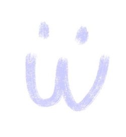
I don’t even know what it’s called, but I really hope it goes the way of Comic Sans
Edit: does anyone actually know what this awful font is called?
Is this Comic Sans Italic?
The essential qualities of a good typeface balance visual beauty with practical function. This is just plain ugly and makes Comic sans look elegant. Using this crud is as acceptable as attending a funeral dressed as a clown.

I know multiple people that would want clowns at their funerals
this is an insult to comic sans; that ai font is way worse than it
I’ve been absolutely shocked walking through city centers and seeing these fucking AI flyers everywhere. Boycot whoever uses this shit and pay your local artists and graphic designers.
Meanwhile I was using a similar font on a lot of designs the last 20 years, and now it was basically stolen and can’t be used anymore 😭
A few of the half decent, small YouTube channels I follow started using it in their thumbnails as a way to polish up their channel. Little do they know is all it does is suck the soul out of their content.
I have developed a rule for myself. If I see a channel using genAI in their thumbnails, it goes on the do not recommend this channel again list.
Me with anything LTT
Is it actually a font? No same letter looks the same - look at every ‘S’ for example, they all differ. Very similar but not the same. Maybe its just slop?
There is a real font called road rage
A YouTuber I used to adore has gone to this shitty ai thumbnail format in recent months, so I’ve stopped clicking on him 😞
I got fed up with that thumbnail font/format a couple of weeks ago and just started blocking every channel that was using it. I didn’t expect it to help much, but it has.
To play devils advocate, I reopened Canva for the first time in forever.
Anti Canva rant
(Any service that could be free/no account, but wants an account is immediate red flag in my book. No one NEEDS an account to make a slideshow or poster. Plus I’m on the haveibeenpwned list of the 2019 data leak. But we 1 week away from the school Christmas concert, and the people in charge insist, )
But when I opened the website, there isn’t a clear warning to say “hey, this font or image pack is AI” you have to read the fine print to know for sure.
Canva itself advertises “hey, use our AI helper”, but for the 3rd party features? Up to the uploaded to say if its AI or not. (Still hate Canva though. Can’t wait for the concert so I can never open the website again)
But when I opened the website, there isn’t a clear warning to say “hey, this font or image pack is AI” you have to read the fine print to know for sure.
This is what annoys me on a lot of 3D asset websites as well. On steam you are supposed to declare if your game includes any AI generated assets and since there is pretty good evidence that that affects purchase numbers, I don’t want to include any. Trouble is, you don’t always know where everything is coming from.
Most people probably wouldn’t care if some background rock was made by AI rather than the human artist, but it still technically breaking the rules, and I suspect that if someone were maliciously inclined they could really make a big thing of it.
Why is it that all AI fliers look like this though?
Because they made that the default look for flyers somehow
This is an insult to comic sans. Comic sans is a good font and helpful to people with dyslexia
Comic sans (originally designed for a comic dog character) is an awful typeface. It is constantly misused in serious settings such business contracts, medical notices, and legal documents. In the UK many schools use it. It is as appropriate as wearing a clown costume to a funeral. Using it makes any professional design look childish, sloppy, or amateurish There is very little peer-reviewed scientific evidence that Comic Sans inherently improves reading performance for students with dyslexia.

It is? I’ve seen a couple fonts meant to combat dyslexia and they look very different from comic sans
To my knowledge Comic Sans predates all of the dyslexia specific fonts. It’s liked in the dyslexia space because all of the letter forms are quite distinct and therefore easily differentiable.
Fascist tech-bro slop font? Just in case it doesn’t have a name I’d like to throw this in the ring.
Fascism Sans
This is an insult to Comic Sans
Yeah, Comic Sans is actually useful.
Wrestling-Sans